Previews and mockups
One take full size, inside an iPhone, iPad or MacBook and a real browser.
Open a preview
A preview fills the window with one variant, over the canvas, which stays where it was underneath.
- From the canvas
- Click the icon above a frame, or right-click the frame and choose Show in Full Screen.
- From the keyboard
- Click a frame, then press ⇧⌘F.
- Back to the canvas
- Esc, or the button with two arrows pointing in.
Inside a device
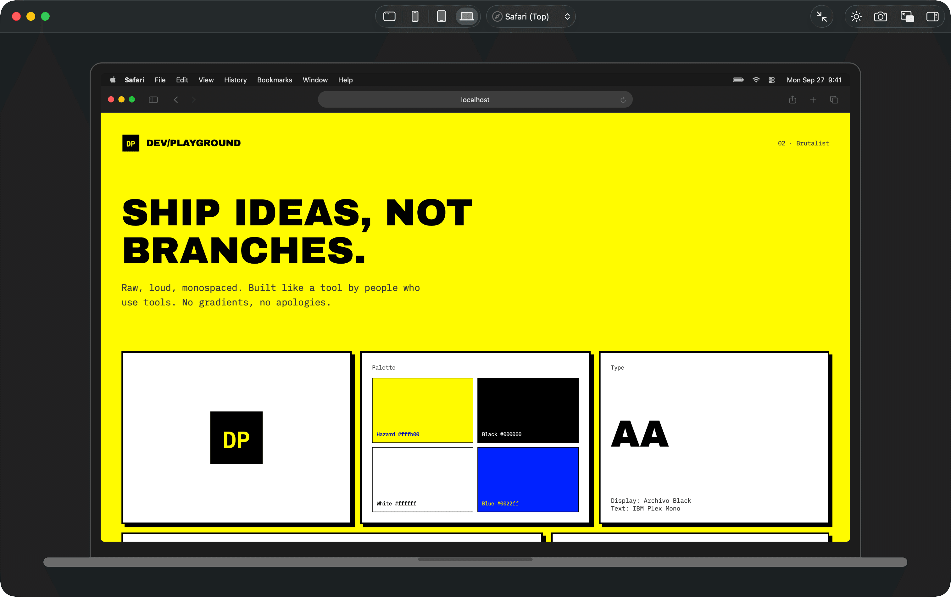
The buttons in the middle of the toolbar show the page filling the window, or inside an iPhone, an iPad or a MacBook, at that device’s real size, scaled to fit.
In a browser
Next to the devices, the Browser menu puts the page inside Safari or Chrome, drawn as each one looks on that device: the status bar or menu bar, the address bar, the toolbar and the tab. Pick No Browser for the bare screen. The choice is remembered, and it is also under View, in Show Preview in Browser.
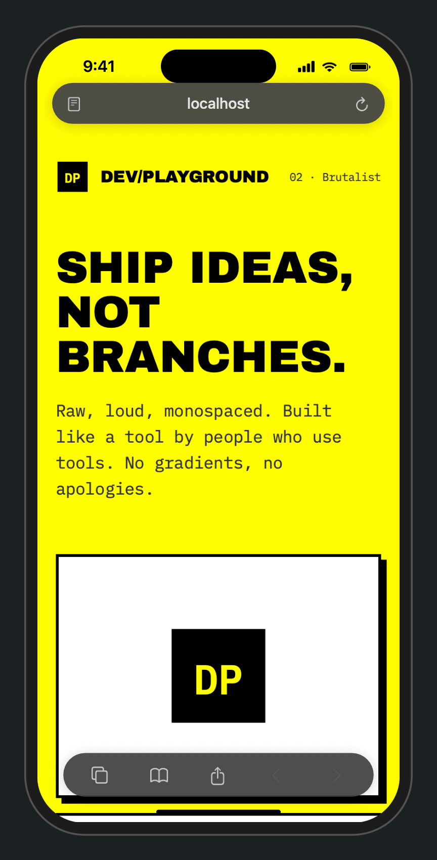
The browser takes its room from the page, as a real one does, so you see how much of the design fits above the fold. On iPhone, Safari comes in both of its layouts.
Scrolling
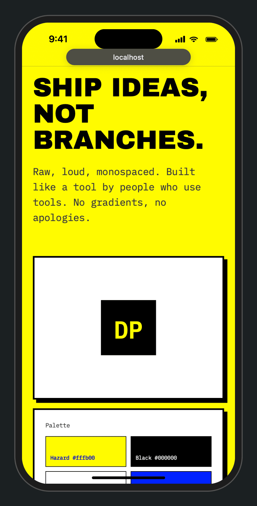
On iPhone the bars behave like the real browsers: they shrink while you scroll down and come back when you scroll up, reach the top, or click the shrunk bar. The page scrolls under them.
| Browser | At the top | Scrolling down |
|---|---|---|
| Safari (Top) | The address at the top, on a band in the page’s own color, and a toolbar floating at the bottom. | The address shrinks to a small capsule and the toolbar goes away. |
| Safari (Bottom) | One floating bar at the bottom with back, the address and more. This is the iPhone’s default. | Only a small address capsule stays, above the home indicator. |
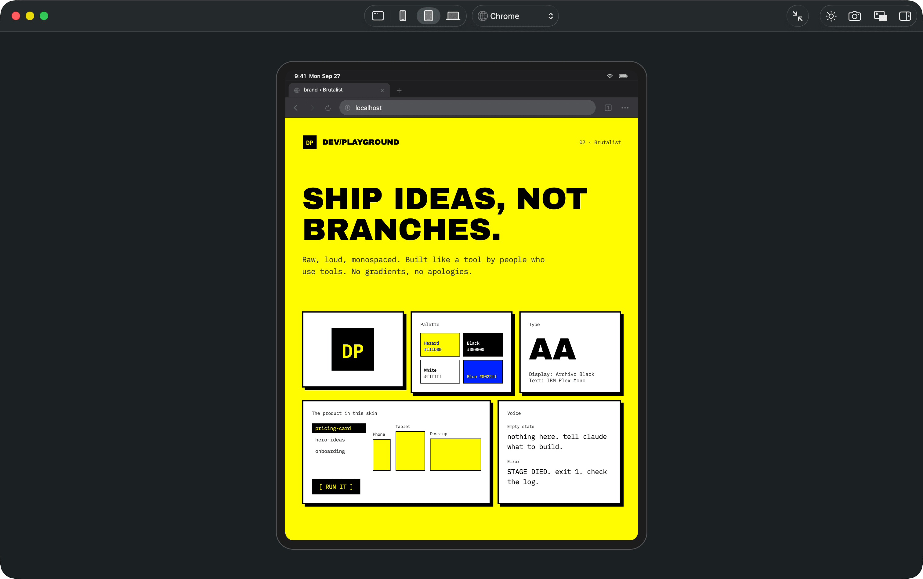
| Chrome | The address bar at the top, and a toolbar at the bottom. | The toolbar slides away and the top shrinks to the address in small type. |
On iPad, Chrome folds its tabs and toolbar into one address line the same way. Safari on iPad and both browsers on the MacBook keep their bars, as they do for real. Safari tints its bars with the color at the top of your page.
Scrolling bars need macOS 26 or later. On earlier versions the bars stay put above the page.
Light and dark
The sun or moon button switches the page between light and dark without reloading it, so whatever you were doing on the page stays. The browser and status bar follow along, as they would on the device.
Screenshots
The camera button saves what the preview shows as a picture: the whole device with its browser, or the page alone when it fills the window. It is also View, Take Screenshot.
It works like the Mac’s own screenshots. The picture goes where your Mac saves screenshots, the Desktop unless you changed it, named like Screenshot 2026-09-27 at 17.52.10.png. You hear the shutter, and a thumbnail floats in the corner for a few seconds; click it to open the picture. If you turned the sound or the thumbnail off for the Mac’s screenshots, they stay off here too.
A window of its own
Open in New Window, the button with two overlapping windows, gives the preview a window of its own, in full screen. Leave full screen and it stays as a regular window, so you can keep it next to the canvas while Claude works. Close it with its close button.
The inspector
The button at the far right, or ⌥⌘I, shows the variant’s controls beside the page. See Controls.